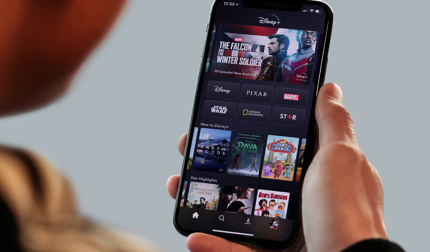
When thinking about traditional App Store Optimization (ASO) tactics, the most common areas of focus are keywords and text. However, the graphics that accompany an app store listing offer significant opportunity for optimization. From colors to text and even particular screenshot placement, images can make a significant difference in whether a potential user downloads an app.
However, not all images are created equal, and what works well in one category might not in another. Leveraging Sensor Tower App Intelligence data, we’ve put together the current trends of app store images across a variety of popular categories. Let’s take a look at how these images are optimized for their respective categories, and how their unique adaptations speak directly to what those categories offer potential users.
Fintech
FinTech apps like Robinhood, Acorns, Cash App, and more are focused on quickly establishing professionalism and user trust in order to win installs. These apps most commonly leverage enlarged fonts or bolded words to emphasize messages that speak to user accessibility and convenience—including words like “advance” to emphasize the ability to make cash advances.
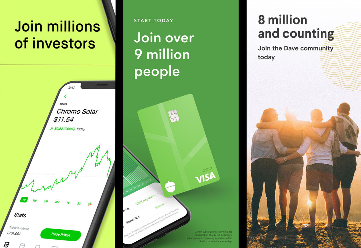
In line with trust establishment, social proof is also a common lever. Apps will show off their user numbers and industry awards to convince potential users of their trustworthiness and safety. That trust is also extended with free offers, such as a complimentary stock or amount of cryptocurrency, to soften up potential users who are looking to get into retail investment or other financial dealings.
News
With the primary goal of selling users on immediacy and breaking news before anyone else, apps like CBS News and News Break leverage bold text within their images to focus on keywords like “live,” “24/7” and “breaking.” This strategy is very similar to what is found in FinTech—bold, plain language designed to promote trust and efficiency—but the focus is slightly more tailored to emphasize the objective of the category.
One unique element to screenshots within the News category is the consistent updating images of recent news articles to appear as up-to-date as possible. Intuitively, it makes sense for apps in the News category to promote their live and breaking news alerts alongside recent news articles, since it would possibly be a turn-off for potential users to see that claim alongside a months-old story. In order to capitalize on this technique even further, some apps use temporary screenshots to emphasize major news cycles, such as results from the 2020 U.S. election.
Streaming
In the highly competitive streaming video space, apps have prioritized screenshots of original content to showcase exclusive events. Some leading apps like Disney+, Netflix, and HBO Max have also added a color gradient, effectively connecting their backgrounds across several screenshots. Many apps have also moved away from having the physical mobile device in the screenshot, and instead utilize the entire screenshot space with content.
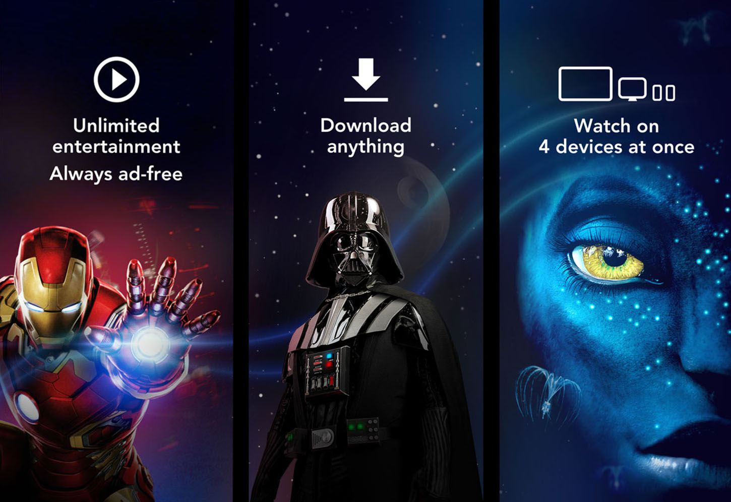
Others, like Showtime, leverage the first screenshot to push high-value new content available on the platform, such as a hit series or a new movie. Exclusive content has become one of the most important levers for streaming apps to win an install in a competitive market, so favorite franchises and buzzy new shows are more likely to catch the eye of a discerning potential user.
Travel
Impacted significantly by COVID-19, the Travel category has had to pivot significantly to focus on different values. With lavish, expensive or wish-list destinations off the table for the time being, apps like Booking.com and Hopper have focused on exclusive deals and the ease of booking an entire trip to sound more appealing to potential travelers. Excitement has now shifted into efficiency, showing off how users can book local trips with little effort.
Of course, the category is also particularly geared towards messaging to accommodate for COVID-19. Apps like Airbnb use their images to highlight live/work spaces, flexible booking dates, and experiences at home for those who are not ready to travel. As vaccinations increase, it will be interesting to see how cleanliness and flexibility remain as major selling points for apps.
Photo & Video
Unlike other entertainment apps, which often utilize a phone frame to show off how the user interface looks in action, apps in the Photo & Video category have moved away from using devices to show off their apps. Instead, the graphics become complete UI screenshots of the app’s interface, often highlighting the ease of the camera or editing tools and showcasing unique features found within the app.
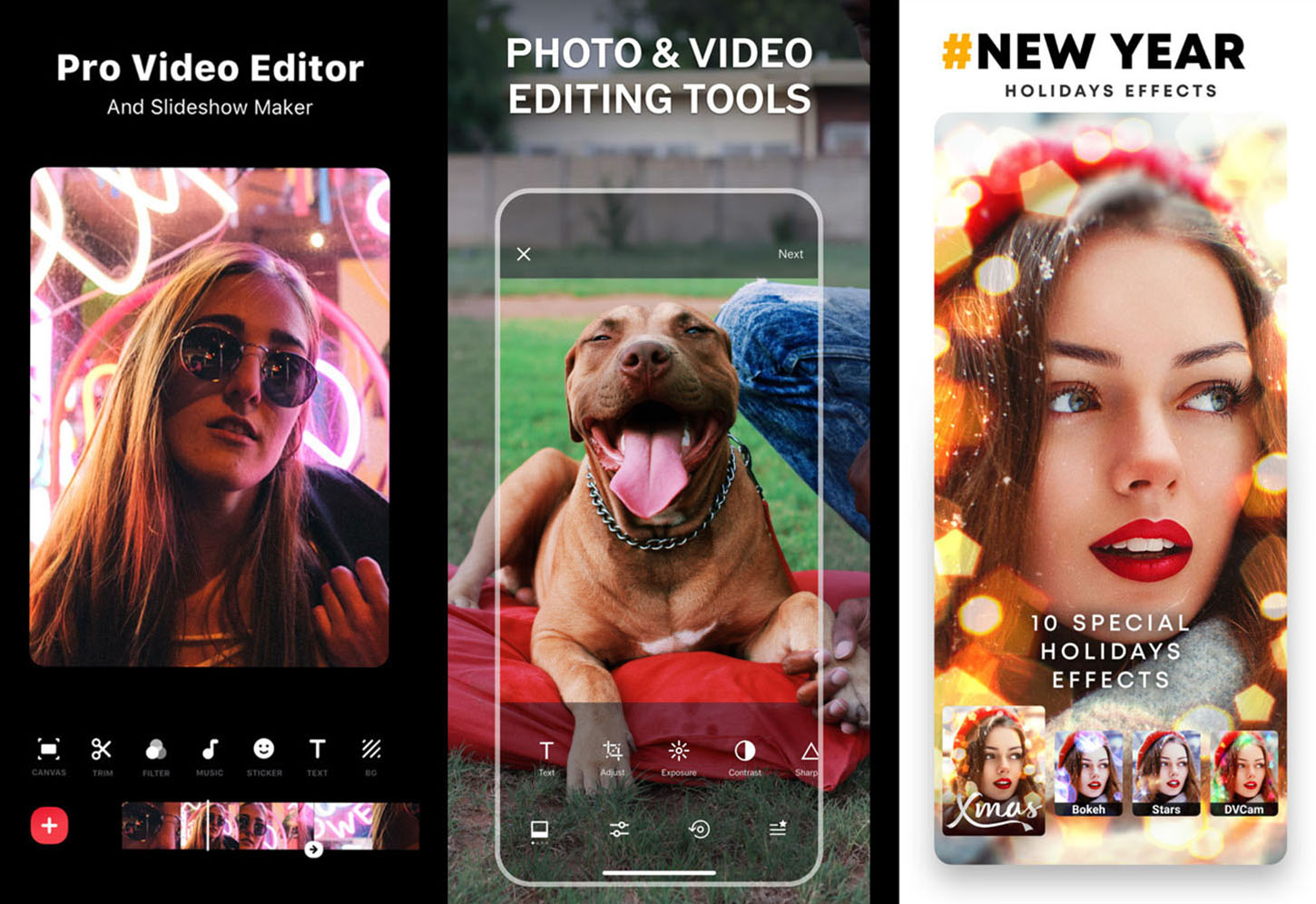
Unique editing techniques and special filters have become popular elements of apps such as Prequel, which regularly promotes seasonal filters—like New Years or springtime—in the primary image spot to give potential users a chance to see what’s new. Similar to the way News apps temporarily highlight events, these little promotions are meant to emphasize how timely and trendy the editing apps are so potential users could leverage them for their own media.
Education
Over the past year, the Education category has become a competitive battleground for mobile users as consumers coping with COVID-19 limitations have tried to pick up or continue learning habits while in shelter-in-place. As a result, this category has been optimized for highlighting a call-to-action in order to catch attention, with apps like Brainly advertising the strong “solve schoolwork” intention behind its tutoring app in bold text and loud colors.
These goals-focused calls-to-action are often presented around trust-building facts that focus on courses offered, subjects covered, or reviews from users. Like Fintech and News, Education apps are primarily focused on proving their credibility to potential users as soon as possible, so highlighting variety and accolades continues to be a major strategy.
Shopping
As one of the categories that pioneered the technique, it’s no surprise that shopping apps lean on the “connected screenshot” style to entice potential users to flip through all the available images. This style allows for apps like Etsy and Poshmark to advertise a wide range of goods available on the app, while also mimicking a seamless flow and user experience that users have come to expect from the category. Unsurprisingly, the products offered still take up the majority of space on any given image, which is again aligned with category goals.
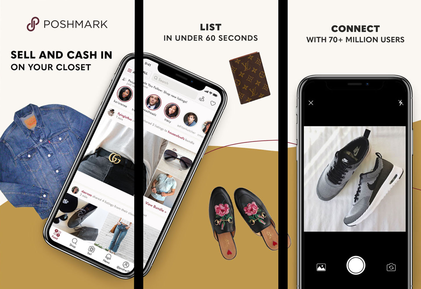
However, one major recent change for the Shopping category is a shift towards shorter, bolder, and larger text in all images. This technique, in addition to being concise and keeping the product front-and-center, also has the added benefit of readability from the app search results page. With larger fonts, shopping apps can advertise item variety, sales, and other benefits in an effort to draw potential users in and win installs.
Optimizing Images for the App Store
The diversity of images across just a handful of categories shows how optimizing for ASO truly is unique to the content and target audience of any given app. While some techniques—such as leveraging temporary images—might be common across a number of categories, the individual approach is subtle and speaks to different goals. As your team continues to explore authentic and category-relevant trends to stand out in ASO, identifying and implementing category-level trends on both images and text is the best setup for success.
Interested in learning more about ASO and how Sensor Tower could help you in your journey? Reach out to our sales team at here.
